Phone Wallpapers: What Makes a Good One (and the Right Size)
Almost everything written about wallpapers assumes a wide screen. Phones are the opposite shape, and that one difference changes every rule.
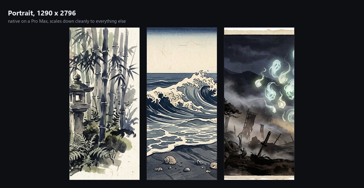
What size a phone wallpaper should be
A safe modern target is 1290 × 2796 — the native panel on the largest current iPhones, and comfortably above what most Android flagships need. Anything smaller gets scaled up; anything larger is simply downscaled, which costs nothing visually.
| Device class | Typical resolution |
|---|---|
| Large iPhone (Pro Max class) | 1290 × 2796 |
| Standard iPhone | 1179 × 2556 |
| Common Android flagship | 1440 × 3120 |
| Older / budget Android | 1080 × 2400 |
The aspect ratios differ slightly between these, so some cropping is unavoidable — which is exactly why the next section matters more than the pixel count.
Why a desktop wallpaper never works on a phone
A 3840 × 2160 landscape image is roughly 16:9 lying down. A phone is roughly 9:19.5 standing up. To fill the screen, the phone crops away about three-quarters of the width and keeps a narrow vertical slice through the middle.
Whatever made the landscape good — a wide horizon, a subject placed by the rule of thirds, sky on one side — is usually the first thing lost. This is why cropping your favourite desktop wallpaper for your phone so rarely works, and why portrait editions are composed separately rather than cut down.
The clock and the dock decide everything
A phone wallpaper is never seen whole. The top fifth carries the clock and date; the bottom quarter carries the dock, and on a lock screen, widgets and controls.
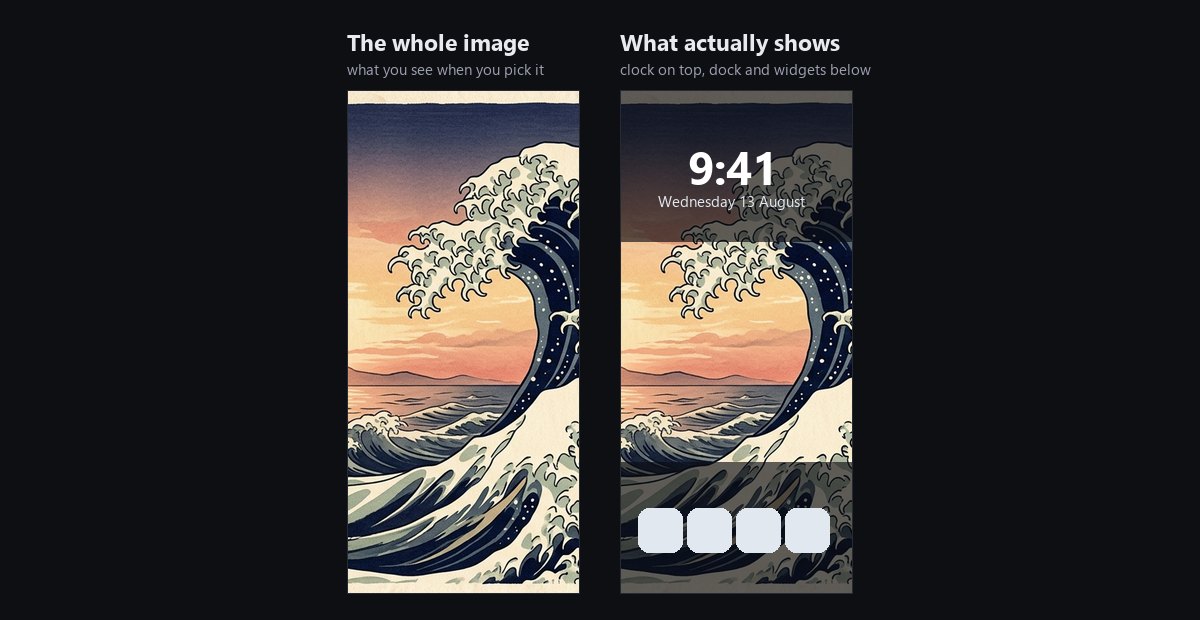
Practical consequences:
- Keep the top fifth simple. A busy top edge makes the clock hard to read — and on iOS, the clock changes weight depending on what is behind it, which looks worse than it sounds.
- Put the subject in the middle band. It is the only part reliably visible on both lock and home screens.
- Expect the bottom quarter to be covered. Do not choose an image for something happening down there.
Dark images have a real advantage
Lock-screen text is white and cannot be changed. A dark or mid-tone wallpaper keeps it readable in every lighting condition; a bright one leaves you squinting at the time outdoors.
On an OLED phone there is a second benefit: dark pixels genuinely use less power, since the panel lights each pixel individually. It is not a dramatic saving, but it is real, and it costs nothing to prefer the darker option.
Lock screen and home screen want different images
Most people set one image for both. They have different jobs:
- Lock screen is seen for two seconds, dozens of times a day. It can afford to be striking — this is where a dramatic image belongs.
- Home screen sits behind rows of app icons. Same rules as a desktop: calm, even, unsaturated.
Both iOS and Android let you set them separately, and it is worth the thirty seconds.
Checklist
- 1290 × 2796 or larger, portrait.
- Composed vertically — not a landscape image cropped down.
- Simple in the top fifth, subject in the middle.
- Dark or mid-tone, so white clock text stays readable.
- Calmer image on the home screen than the lock screen.
The mobile editions here are rendered in portrait from the start at 1290 × 2796, with the composition planned around the clock and dock rather than cropped and hoped for.


Browse all phone wallpaper collections →
Created with AI-assisted painterly rendering, then curated, upscaled and finished by hand.