What Wabi-Sabi Actually Means (and Why It Suits a Desktop)
Wabi-sabi gets used in interior catalogues as a synonym for "beige and a bit rustic". The actual idea is more specific, and more interesting.
Two words, two ideas
Wabi originally carried a sense of loneliness or poverty, and shifted over time toward something closer to a quiet sufficiency — the richness available in a simple, spare thing.
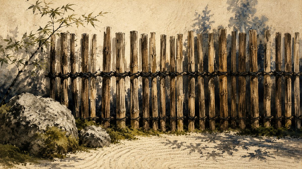
Sabi is about time. The patina on a bronze handle, silvered wood, moss in the crack of a step. Not decay as damage, but the visible record that something has been in the world for a while.
Together they describe an aesthetic that finds worth in what is imperfect, impermanent and incomplete — the opposite of the showroom ideal, where everything is new, symmetrical and finished.
Where it was cultivated
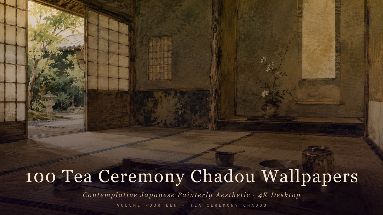
The idea sharpened in the Japanese tea ceremony. Tea practice deliberately favoured plain, locally-made, slightly irregular ware over imported perfection — a bowl with an uneven glaze, a room small enough that the door forced you to bow entering.
That was a choice, not a limitation. The restraint was the point: strip away display and what remains has to hold attention on its own.
What it looks like in practice
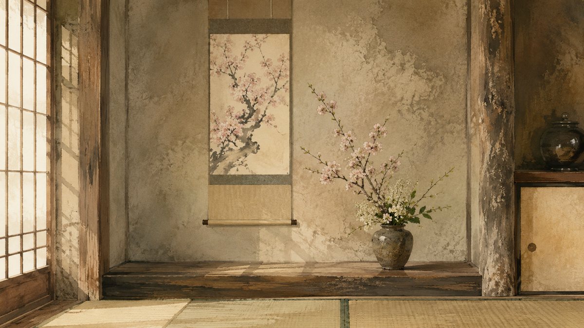
- Natural materials, visibly aged. Wood, clay, stone, paper — showing wear rather than hiding it.
- Muted, low-saturation colour. Earth, ash, moss, unbleached linen.
- Asymmetry. Balance, but never mirror-symmetry.
- Empty space treated as content. The gap is doing work, not waiting to be filled.
- Soft, diffuse light. Overcast rather than bright sun.
What it is not: a colour palette you can apply to anything. A grey sofa is not wabi-sabi because it is grey.
Why it works on a desktop
This is the practical part. A desktop wallpaper has a job most images do not: it has to sit behind your work for eight hours without competing for attention.
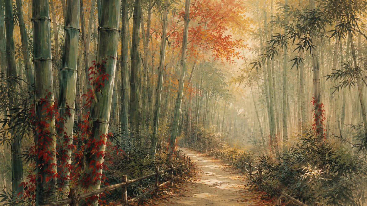
Wabi-sabi imagery happens to be built for exactly that. Low saturation does not fight your interface colours. Diffuse light means no hot highlight pulling your eye to the wrong corner. Generous empty space gives icons and windows somewhere to sit. And an aesthetic whose whole premise is restraint does not get tiring the way a dramatic image does by the third day.
Put plainly: images designed not to demand attention are the correct choice for a surface you look past all day.
A caveat worth stating
Wabi-sabi is a living aesthetic tradition with centuries behind it, not a filter. These collections are painterly interpretations made in that spirit — informed by the tradition, not claiming to be part of it. Treated as inspiration rather than costume, the ideas hold up remarkably well on a screen.
Browse all Japanese aesthetic collections →
Created with AI-assisted painterly rendering, then curated, upscaled and finished by hand.