Choosing a Wallpaper You Can Actually Work In Front Of
There is a difference between an image you enjoy looking at and an image you can work in front of. Most people pick the first and wonder why they switch it out a week later.

1. Keep the interesting part away from your icons
Icons live in a corner — top-left on Windows, wherever you have put them on macOS. Whatever sits behind them, you read through.
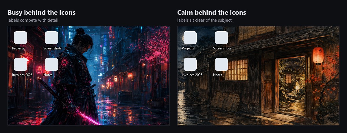
A useful test: put the wallpaper on, then try to find a specific file by eye. If you have to hunt, the image is too busy where it matters.
2. Even tone beats dramatic contrast
An image that runs from near-black to blown-out white gives your interface nowhere consistent to sit. Text labels styled once cannot be legible against both ends.
Pick images with a narrow tonal range — either consistently dark or consistently light. Both work. It is the swing between them, within one image, that causes trouble.
3. Watch saturation, not just brightness
Highly saturated wallpapers make everything in front of them look slightly wrong. Your editor's syntax colours, an app's accent, a photo you are working on — all get judged against that backdrop by your eye.
Muted images are not a matter of taste here so much as a matter of not lying to yourself about colour.
4. Avoid implied motion and strong diagonals
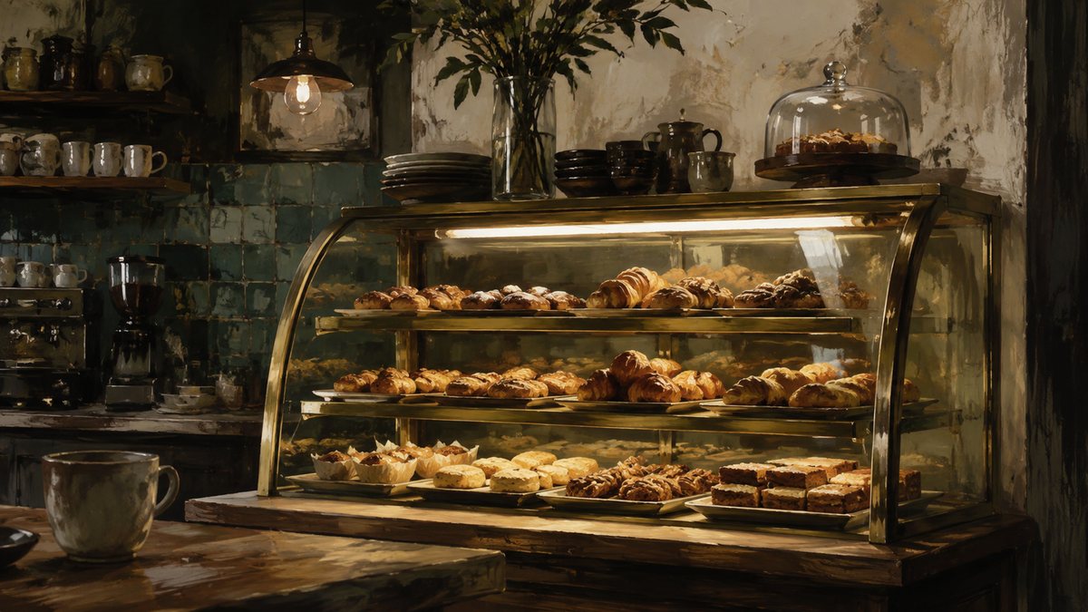
Strong diagonals and anything that reads as movement keep pulling the eye. Fine in a gallery, tiring at hour six. Horizontal compositions and settled subjects sit still.
5. Rotate — but within one set
The fastest way to stop noticing a wallpaper is to see it every day. Rotation solves that, as long as the images share a visual language; otherwise each change is a small jolt.
This is the argument for using one collection as your rotation folder rather than a scrapbook of favourites. Setting up automatic rotation takes about two minutes on either platform.
The short version
- Quiet where your icons are.
- Narrow tonal range — consistently dark or consistently light.
- Muted colour, so it does not distort how you see everything else.
- Settled composition, no implied motion.
- Rotate within a single coherent set.
None of this rules out a striking image. It just suggests keeping the striking ones for the lock screen, where you see them for two seconds rather than eight hours.
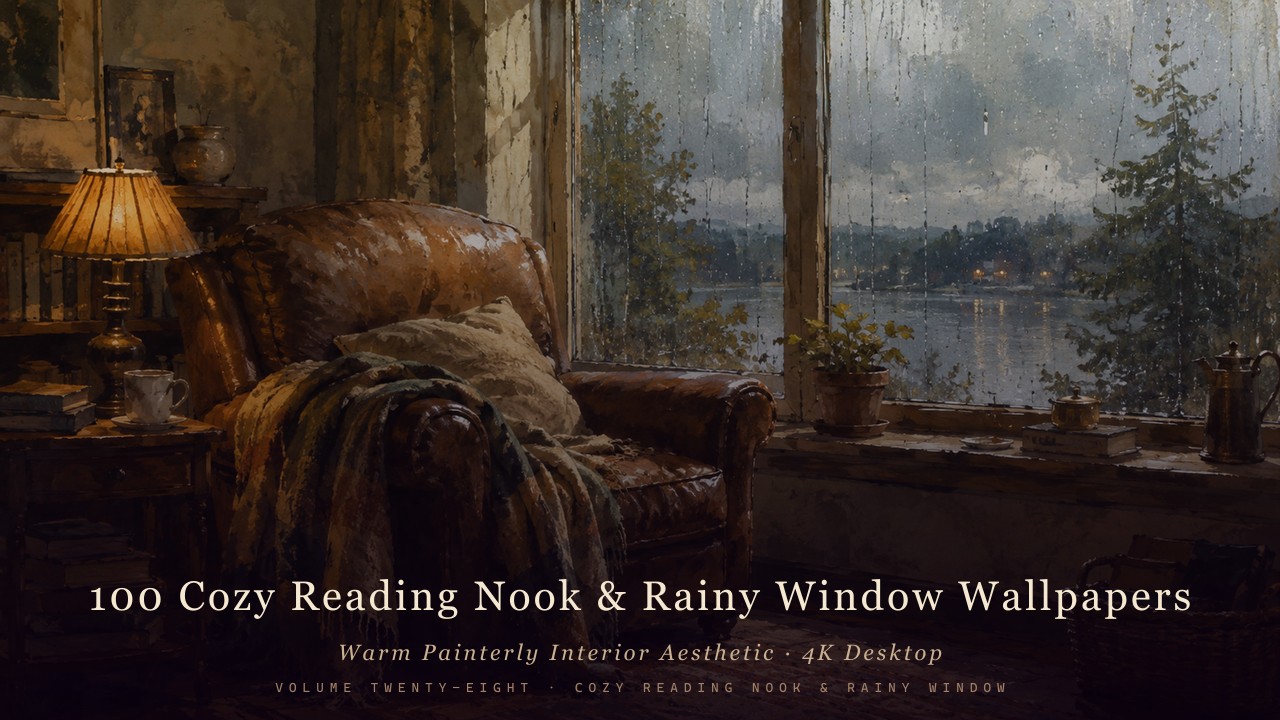
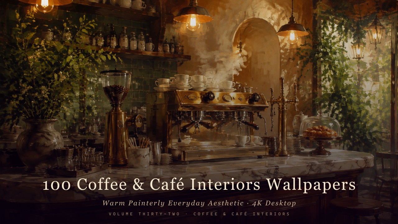
Browse all cozy interior collections →
Created with AI-assisted painterly rendering, then curated, upscaled and finished by hand.