Eight Desktop Wallpaper Styles Worth Knowing
"A nice wallpaper" is not a useful search. Style is, and knowing the vocabulary makes finding one much faster.
Below are eight aesthetics that come up again and again, with what actually defines each — and, since the point of a wallpaper is to live behind your work, an honest note on how each behaves during a working day.

1. Japanese minimalism
Muted earth tones, natural materials, asymmetric composition and a lot of deliberate empty space. Dry gardens, tatami rooms, a single branch against plaster.
On a desktop: the strongest option for long sessions. Low saturation, narrow tonal range, generous space for icons. If you only try one style, try this one. More on the idea behind it →
2. Cyberpunk and neon urban
Wet streets, saturated magenta and cyan, deep shadow, dense signage. High contrast by definition.
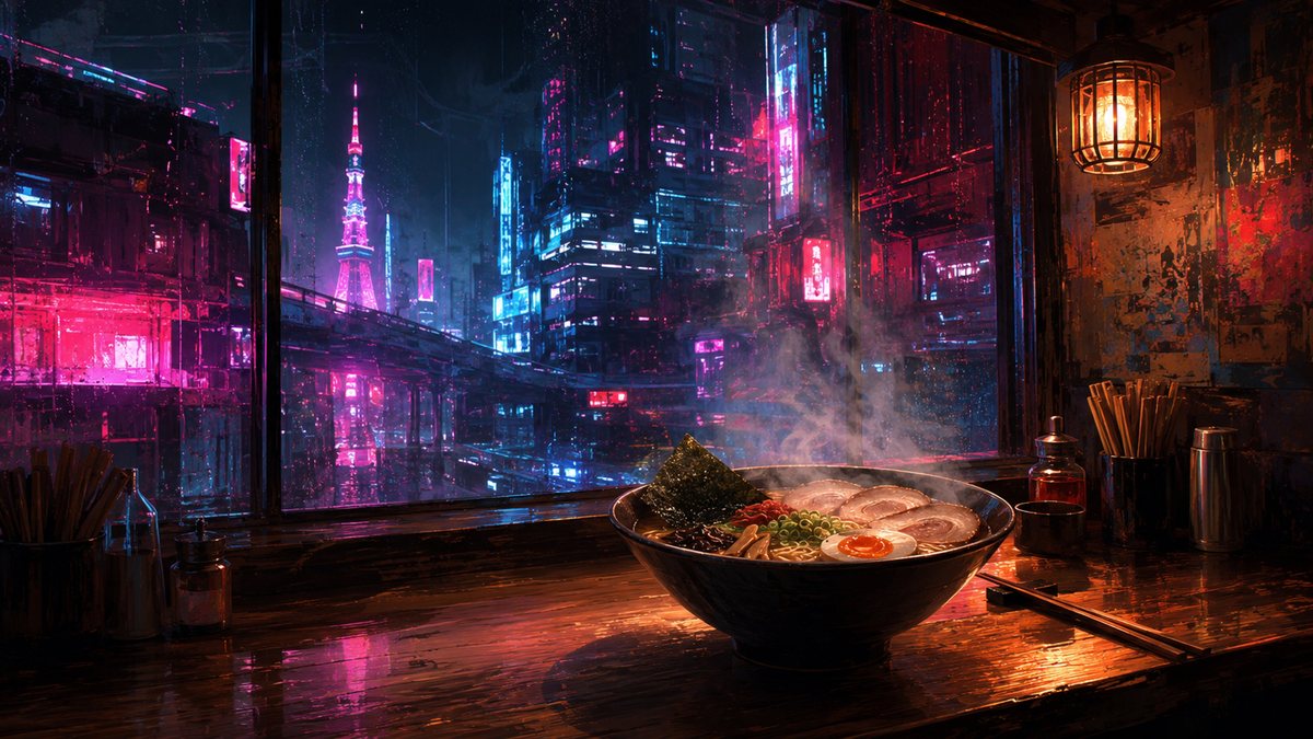
On a desktop: spectacular for a day, tiring by the end of the week. The saturation also skews how you judge colour in anything you are working on. Best on a second monitor, a lock screen, or a machine you do not stare at for eight hours.
3. Nordic and Scandinavian minimal
Pale snow, bare birch, fog, a single cabin. Very little in frame, and what is there is low contrast.

On a desktop: excellent, with one caveat — pale backgrounds make white icon labels harder to read. If your desktop is icon-heavy, prefer the darker images in this style.
4. Painterly landscape
Mountains, coastlines, deserts, forests — rendered with visible brushwork rather than photographic detail. The painterly treatment matters: it softens fine detail that would otherwise compete with your interface.
On a desktop: reliable. Look for images with a calm sky or open water in the corner where your icons live.
5. Celestial and astronomical
Moon phases, star charts, orbital diagrams. Usually dark, usually symmetrical, often closer to illustration than landscape.
On a desktop: dark and even, so light icon labels always read. The diagrammatic ones are calmer than photographic night skies, which tend to have one very bright element pulling your eye.
6. Cozy interiors
Reading nooks, cafés, workshops, rain on glass. Warm light, worn materials, human-scale spaces with nobody in them.
On a desktop: among the best. Warm without being saturated, detailed without being busy. Why that combination works →
7. Vintage botanical and antique print
Herbarium plates, specimen drawings, aged paper. Flat, illustrative, restrained by the conventions of the printing they imitate.

On a desktop: good, and unusually distinctive. Like Nordic minimal, watch icon legibility against the pale paper tone.
8. Cultural heritage and architecture
Palaces, medinas, temples, canal cities. Ornament, pattern and warm stone.

On a desktop: striking, but ornament is dense detail. Choose frames where the pattern sits away from your icon corner.
Picking between them
| If you want… | Try |
|---|---|
| To forget it is there | Japanese minimalism, Nordic minimal |
| Warmth without clutter | Cozy interiors |
| Something with impact | Cyberpunk, heritage architecture |
| Dark, so icons always read | Celestial, night urban |
| Distinctive but calm | Vintage botanical |
Whichever you land on, the practical advice is the same: pick one style and stay inside it. A folder that mixes cyberpunk with vintage botanical will never feel settled, however good the individual images are.
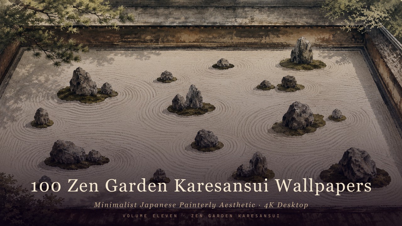
Zen Garden Karesansui
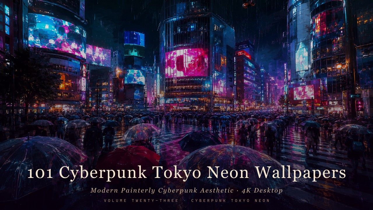
Cyberpunk Tokyo Neon
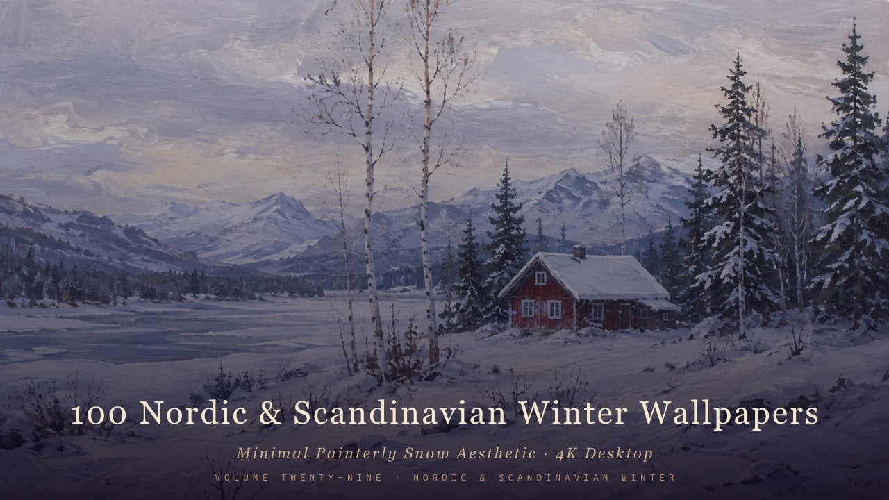
Nordic & Scandinavian Winter
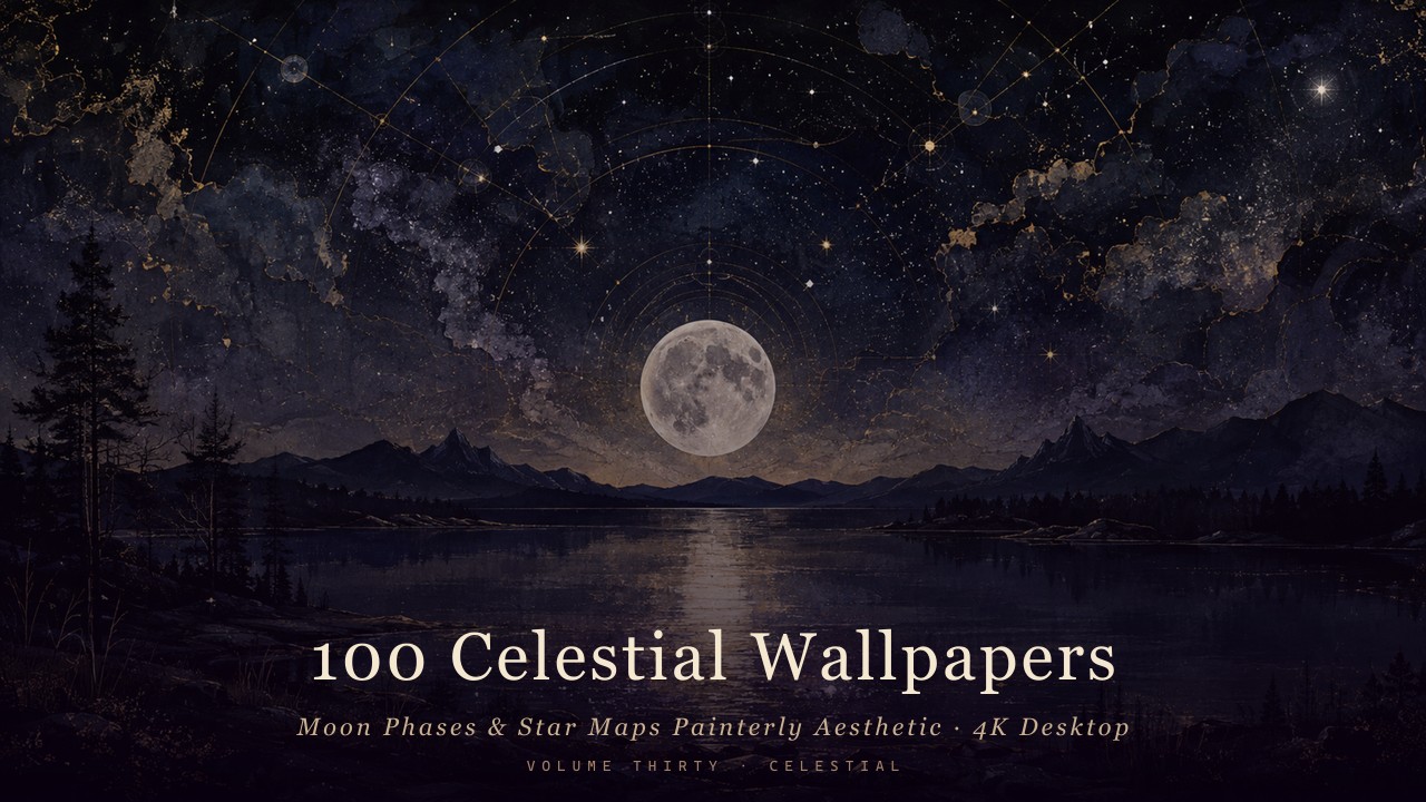
Celestial — Moon Phases & Star Maps
Browse all collections by style →
Created with AI-assisted painterly rendering, then curated, upscaled and finished by hand.